



This September marks one year since we launched Revelio Public Labor Statistics (RPLS) amid an unusual moment for US economic data. Last August, after a Jobs Friday report from the Bureau of Labor Statistics showed weaker-than-expected job gains and steep downward revisions to prior months, President Trump fired the BLS commissioner, accusing her of "rigging" the numbers to smear his administration. This move sent shockwaves through the economic and business community, with critics warning that politicizing statistical agencies risks eroding public trust in data that markets, policymakers, and businesses rely on every month.
This incident compounded problems the BLS was already facing. Response rates on household and establishment surveys have been falling for years, raising real concerns about coverage and representativeness, and funding shortfalls have limited the agency's ability to modernize how it collects data in the first place. None of that was new, but it made the commissioner's firing feel less like an isolated event and more like a symptom of the BLS being under real strain. As we strongly believe in the importance of alternative data, we saw an opportunity for private-sector data to fill the gap.
That's the backdrop we launched RPLS into: A public, monthly, alternative view of the labor market built from hundreds of millions of public professional profiles and job postings, designed to run alongside the BLS's own releases. A year in, this newsletter is our own check-in. How closely has RPLS actually tracked the official data it set out to complement, where do the two agree, where do they diverge, and what have we learned from watching both side-by-side for twelve months?
The three sources of employment statistics
Revelio Labs is not the only private sector provider of monthly employment data. For years, ADP, the payroll management company, has been providing its estimate on monthly employment in the private sector. It's worth being precise about how RPLS, BLS, and ADP each arrive at their numbers, since the differences in their underlying data help explain where and why the three series diverge.
RPLS is built from individual-level data drawn from hundreds of millions of public professional profiles, standardized and adjusted to be nationally representative. The sample includes both private and public sector workers, full-time and part-time, but explicitly excludes military personnel, interns, the self-employed and proprietors, and workers currently on leave or sabbatical. The Bureau of Labor Statistics, by contrast, relies on the establishment survey, which samples about 121,000 businesses and government agencies across roughly 631,000 worksites and is the source of the monthly "headline" payroll number.
ADP's numbers come from a third, entirely different source: its own payroll processing systems, covering roughly 25 million private-sector employees whose paychecks ADP itself administers. That makes ADP's data uniquely direct in one sense, since it's drawn from actual payroll records rather than a survey or public-profile sample, but it also means ADP's scope is the narrowest of the three: private-sector employment only, with no federal, state, or local government workers at all, unlike BLS and RPLS, both of which span the full public and private workforce.
In what follows, we compare RPLS estimates to those from both the BLS and ADP, and note how these differences in coverage may lead to gaps between series
We start by assessing how RPLS estimates compare to those of BLS’s Establishment Survey. In the figure below, we show RPLS's estimated monthly employment changes against BLS's. The dispersion of points around the 45-degree reference line indicates that the headline signal moves in the same direction as BLS most of the time. The two series post a Pearson correlation of 0.77 across the full history back to January 2022. It’s worth noting that RPLS estimates exceed those of the BLS in roughly as many months as it understates it, so there isn't a consistent lean in either direction across most of the sample. The place that pattern breaks down is in BLS's biggest print months, the handful where BLS announced its largest gains, with 700 to 800 thousand jobs added. While RPLS came in well below the line, at roughly 270–400k jobs added, the direction of the trend was the same, and the difference came from the magnitude of the jobs added.
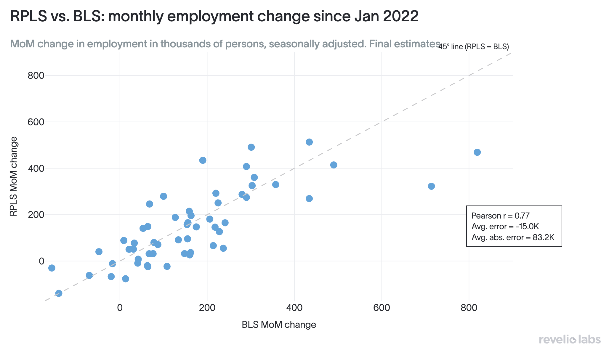
When we look at the average error of RPLS estimates compared to BLS estimates, we find that RPLS estimates come on average 15k jobs below BLS, which could be interpreted as a persistent understatement. But since RPLS runs higher about as often as it runs lower than BLS estimates, most of that average error is driven by a handful of extreme BLS months. These large gains in employment recorded by BLS are in the months following the pandemic, when furloughed workers were being recalled: a pattern that is hard to capture from online professional profiles. When looking at the average absolute error between RPLS and BLS (as opposed to the net error), we find that in a given month, there is a gap of 83k in either direction. This shows that RPLS estimates are not consistently biased in either direction.
Looking at the correlation across the three estimates of monthly employment gains in the US, RPLS monthly change correlates with BLS at 0.77 and with ADP at also 0.77. Meanwhile BLS and ADP correlate with each other at just 0.67, the lowest of the three pairings. In other words, RPLS agrees with each of the other two more than they agree with each other. This indicates that the employment estimates of RPLS tend to bridge what the other two series are separately signaling about the labor market.
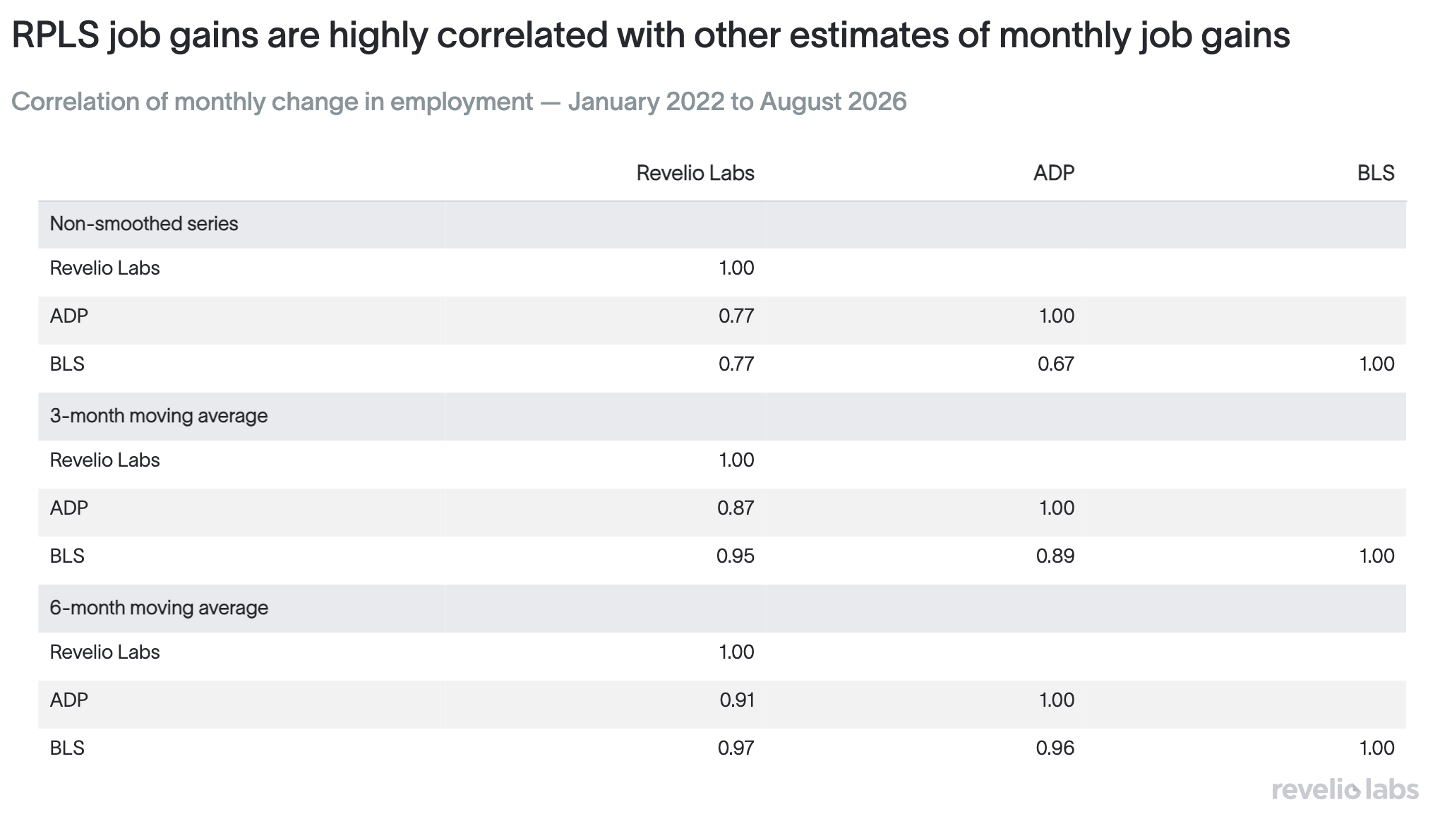
To smooth out month-to-month noise in the series, we take a 3-month rolling average of each series. As expected, correlations rise across the board: RPLS and BLS now move together at 0.95, RPLS and ADP at 0.87, and ADP and BLS also at 0.89. Once the high-frequency noise in any given month is averaged away, RPLS actually tracks the official BLS trend more closely than ADP does.
When we expand the smoothing window to six months, the three sources converge almost completely. RPLS and BLS reach a correlation of 0.97, ADP and BLS reach 0.96, and RPLS and ADP reach 0.91. The three independent series estimated using entirely different data (professional profiles, payroll records, and household and business surveys), tell a similar story about the labor market in the long run. It's also worth noting that even here, RPLS's correlation with BLS is the highest of the three pairings, just as it was in the raw and 3-month smoothed comparisons, a consistent pattern across every time horizon we looked at.
Why RPLS estimates move less than those of BLS and ADP
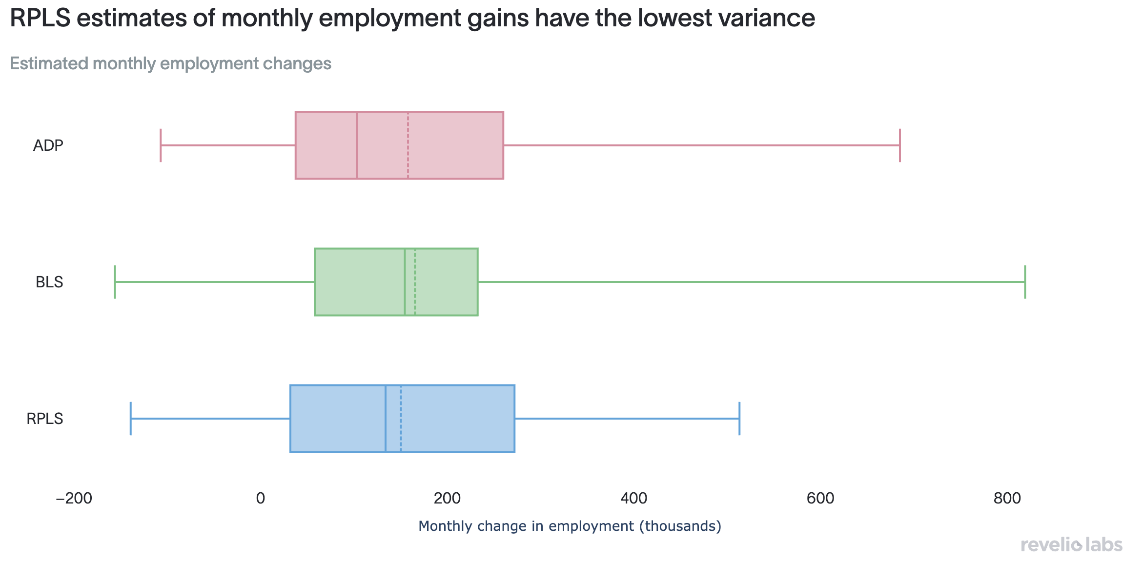
Since January 2022, BLS has averaged 165.3k in monthly job gains and ADP 157.9k. By comparison, RPLS averages much lower: 150.3k jobs added per month. That difference in levels shows up in the figure below, which displays the distribution of each series. RPLS distribution is much narrower compared to BLS and ADP distributions that are more spread out, with visibly large outliers. RPLS standard deviation is 158.6, versus 177.9 for BLS and 183.6 for ADP. RPLS month-to-month swings are, on average, roughly two-thirds the size of the other two. Because RPLS moves less than the other sources, it will, almost by definition, undershoot the truly large swings when they happen, the same pattern we saw in the scatter plot earlier in this piece. But that low variance also means RPLS is less prone to the kind of single-month noise that can make a series look like it's reversing its trend when it is not.
The relative positioning of the three estimates
We can compare each source to the other two every month, not against a single reference number, by asking which one lands in the middle and which two are pulling in opposite directions around it. For every month since 2022, we sorted RPLS, BLS, and ADP by their reported change in employment and looked at the share of months each source came in lowest, in the middle, or highest of the three.
The pattern lines up with what we already saw in the raw numbers. Of the three sources, RPLS is most likely to land in the middle. In 26 months since January 2022 (48% of all months), RPLS estimates landed in the middle between BLS and ADP estimates, compared to 25% for BLS and just 27% for ADP. When RPLS isn't in the middle, it tends to be the lowest of the three rather than the highest, coming in lowest in 29% of months, consistent with it having both the lowest average monthly job gain and the least month-to-month volatility of the three. In other words, RPLS is more often the median voice between BLS and ADP than either is of the other, and when it isn't, it tends to undershoot rather than overshoot employment estimates.
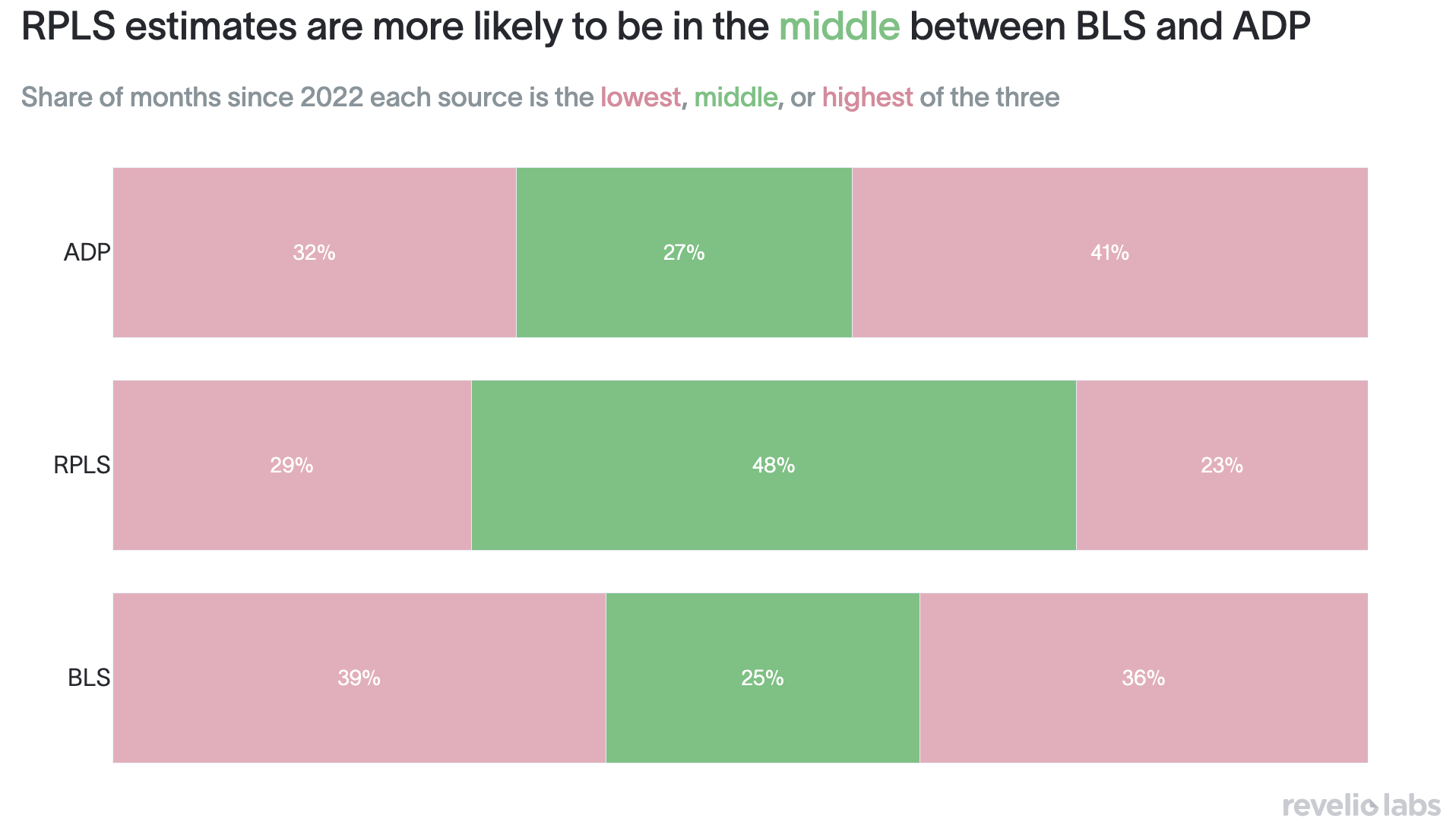
Even though RPLS overstates BLS about as often as it understates it in a direct, pairwise comparison, the figure above shows RPLS landing at the bottom of the three-way ranking far more often than the top. RPLS estimates of employment gains come the lowest in 29% of months against just 23% highest. Because RPLS has a relatively low variance compared to BLS and ADP, it's less likely to ever be the single highest of the three, even in a month where it's running above BLS. BLS is the estimate that is most likely to be the highest of the three. This is tied largely to the post-pandemic recall of furloughed workers, a pattern that's hard to pick up from professional profiles in the same way. So RPLS is the more modest, middle-of-the-road estimate of the three.
Sectoral breakdown of job gains
We also wanted to know how tightly RPLS and BLS move together within each sector. Correlating month-over-month change by sector since January 2022, we find that there is positive correlation between RPLS’ estimates of employment gain and those of BLS across all sectors. The sectors with the highest correlation are Wholesale Trade and Leisure & Hospitality. On the other hand, correlations are lowest in the Utilities and Educational Services sectors.
The figure below shows the cumulative number of jobs added by sector since January 2022. RPLS and BLS agree on the broad shape of the story: Health Care & Social Assistance, Leisure & Hospitality, Public Administration, and Construction have been the biggest sources of net job growth over that period in both series, while Retail Trade and Information are among the few sectors where employment has run flat to negative. Where the two series diverge is magnitude. These differences are likely attributed to how each series is actually built. RPLS is constructed from professional profiles, which capture white-collar, professional roles more completely than frontline or hourly work.Thus, in sectors such as Professional & Business Services and Financial Activities, where that kind of coverage matters most, we believe RPLS's estimates, roughly 1.3 million and 380k in cumulative gains respectively, may even be the closer read on what's actually happened, compared to the gains of 300k and 150k reported by the BLS.
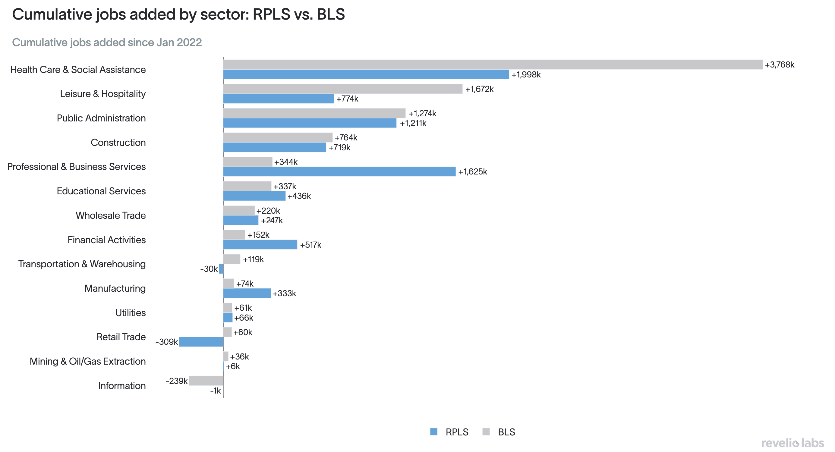
Health Care and Social Assistance is a different story. It's RPLS's single largest source of cumulative job growth in raw terms, but BLS's estimate is still meaningfully larger, about 3.8 million against RPLS's 1.9 million. Given how central health care has been to BLS's overall payroll growth over this period, this may be a case of the BLS overshooting the true scale of healthcare hiring, rather than RPLS falling short of it.
Public Administration is a related but separate case worth flagging on its own: BLS's "Government" series is broader than RPLS's Public Administration category, since it also includes public-sector teachers and healthcare workers that RPLS classifies under Education and Health Care instead, so some of that gap is definitional.
Revisions
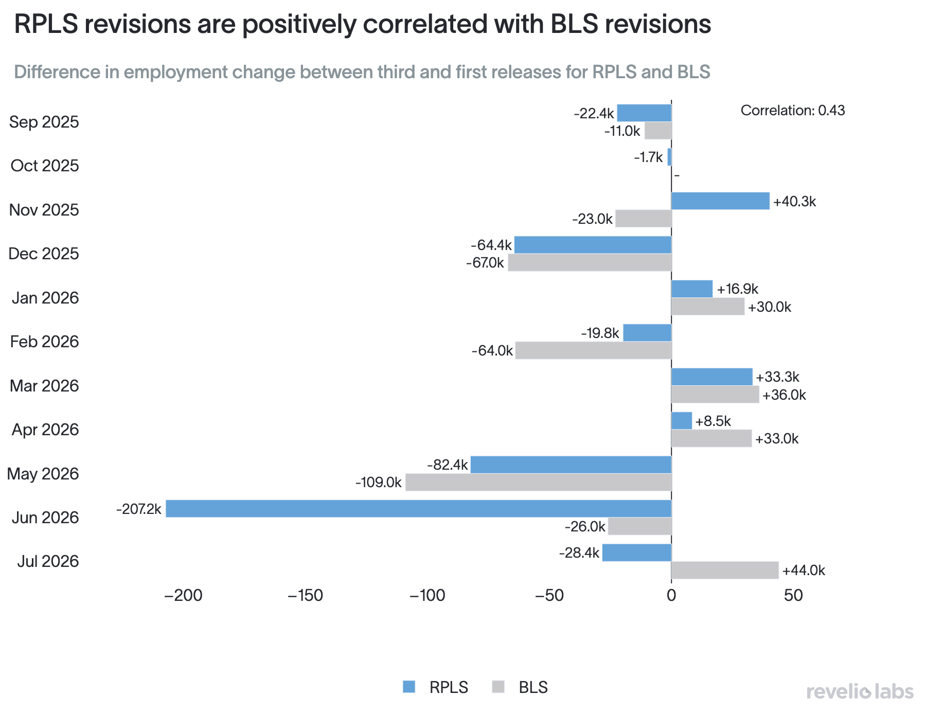
We also looked at how much our own estimates move between first and final release, and how that compares to BLS's revision history over the past 12 months. The correlation between RPLS's revisions and BLS's over the past 12 months is positive at +0.43, meaning that RPLS and BLS usually err in the same direction from initial estimates. Typically both series get revised downwards. RPLS revisions from first to final release have been larger in magnitude, with an average absolute revisions of 47.7k jobs, compared to average absolute revisions of 44.3k jobs from the BLS.
Hiring and separation
On hiring and attrition, the key takeaway from RPLS and BLS is the same: both have fallen sharply from their post-pandemic peaks, leaving the labor market in its current low-hire, low-fire environment. Layoffs remain low, but so does hiring. Relative to 2022, this less dynamic labor market leaves less opportunity for many workers.
While the main takeaway remains the same, the two series have diverged somewhat over the past year, with RPLS data presenting a less rosy picture. While RPLS continues to show a decline in both hiring and attrition, BLS shows that the two have largely leveled off, with hiring potentially showing a slight uptick.
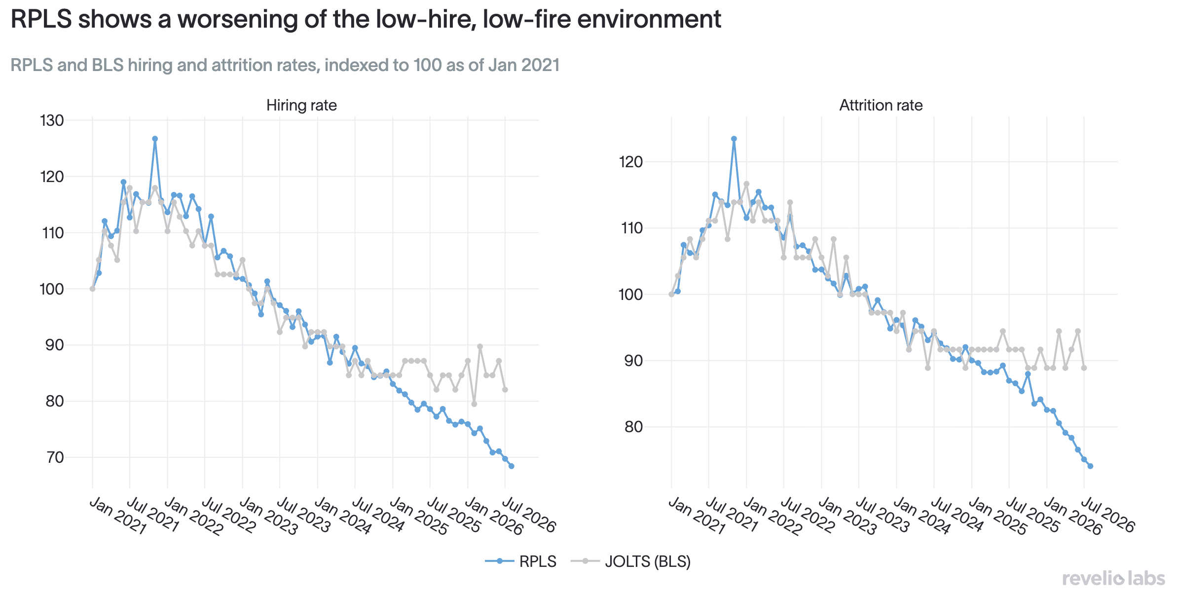
There has always existed a sizable level gap between the two series, in part because JOLTS captures a broader set of gross payroll flows that do not necessarily represent persistent job transitions. As we noted a year ago, RPLS focuses on permanent moves captured in professional profiles, while JOLTS captures a broader set of payroll flows, including seasonal and short-term hiring, rehires and recalls, and transfers between establishments, as well as other establishment-level flows that may not appear as position changes in RPLS. These differences tend to inflate JOLTS readings relative to what HR leaders would typically mean by hiring and attrition.
These differences may also help explain the recent divergence in trend. Industry JOLTS data suggest the modest uptick in aggregate hire and separation rates is being driven by higher-turnover sectors like retail, while lower-churn areas like education and health have not rebounded in the same way. Temporary and contingent staffing also shows up across many industries, not only traditionally seasonal ones. Professional and business services, for example, still include substantial temp and contract staffing. That kind of churn can keep JOLTS hire and separation rates looking steadier (and higher overall) even as permanent professional job-changing continues to weaken in RPLS.
Job Postings
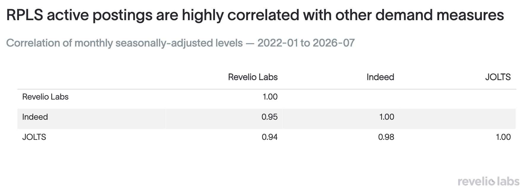
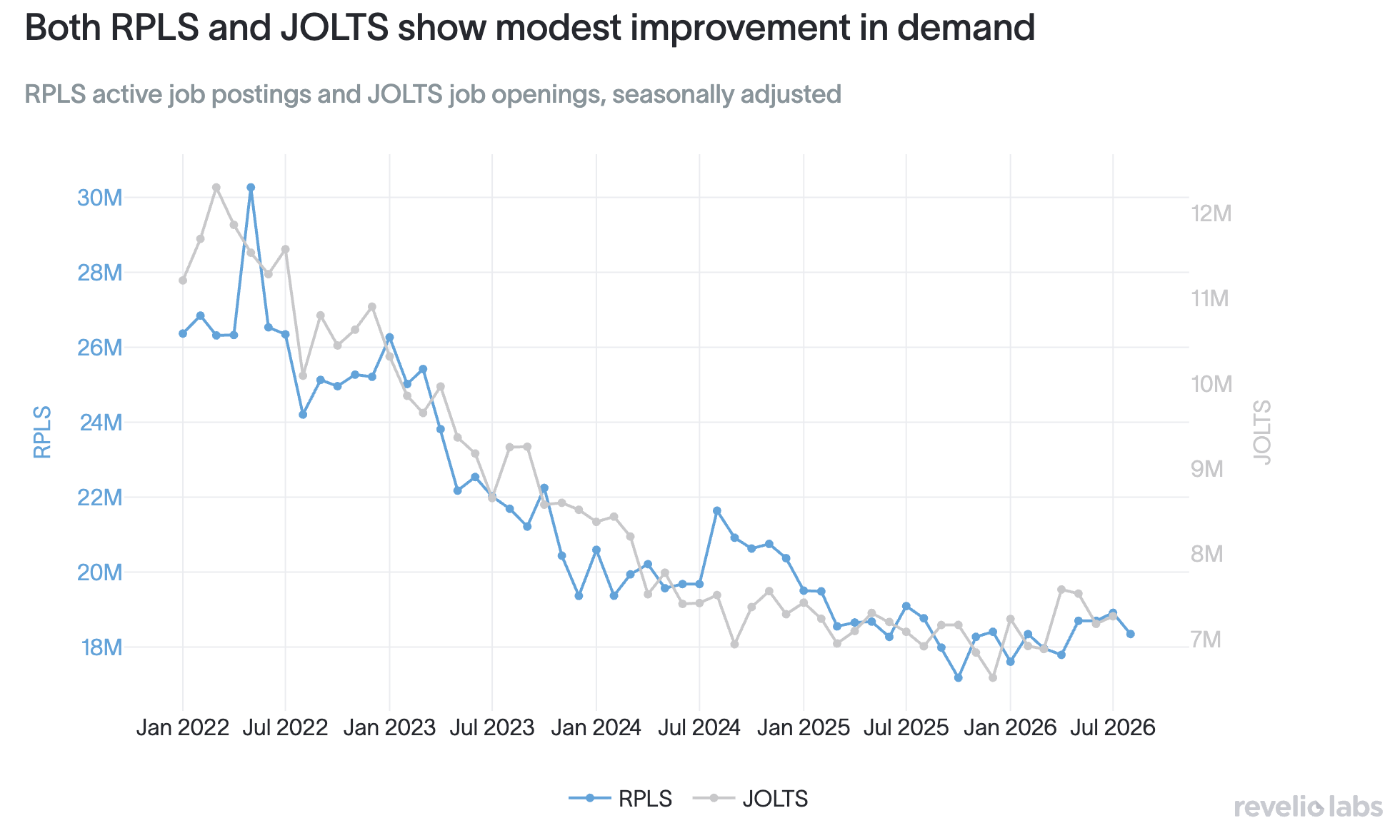
On labor demand, RPLS and JOLTS remain closely aligned. RPLS active postings and JOLTS job openings have tracked each other tightly since the beginning of the series and continue to do so. RPLS is also closely aligned with Indeed’s measure of labor demand: since January 2022, the monthly seasonally adjusted levels of RPLS active postings, Indeed’s job postings index, and JOLTs openings are all highly correlated. Broadly, private job postings data and BLS openings are showing the same pattern: a sharp decline in labor demand, followed by a more recent leveling off with signs of modest improvement.
That alignment in trend is notable as the series are constructed very differently. While RPLS measures active job postings aggregated across a wide set of online sources (including all postings on Indeed), JOLTS is a voluntary establishment survey in which firms report openings as of the last business day of the month, and only under a strict definition: to be counted, a specific position must exist with work available, the position is intended to start within 30 days, and the employer must be actively recruiting externally. In contrast, the RPLS series counts any job posting that was active during the month, and they need not map to a specific start date. The sample sizes are also very different, as JOLTS is based on a survey of around 21,000 establishments, while RPLS draws on a pool of millions of job postings. In addition, RPLS is released a full month ahead of JOLTS, providing a much timelier read on labor demand.
These distinctions can become even more important as poor response rates make estimation via surveying increasingly difficult. Following years of declines, JOLTS response rates are now trending in the mid-30% range, down from ~60% in the 2010s. Lower response rates can undermine the effectiveness of JOLTS readings, which is one reason timely alternative measures of job openings are especially useful.
While both series remain roughly 40% below their 2022 peaks, we are beginning to see signs of improvement: RPLS active postings have edged up since last August, as have JOLTS openings. That leveling off in demand is not uniform across the economy: about half of the industries we track are now showing gains in demand, a stark contrast to the near-universal declines we were seeing before.
Salaries
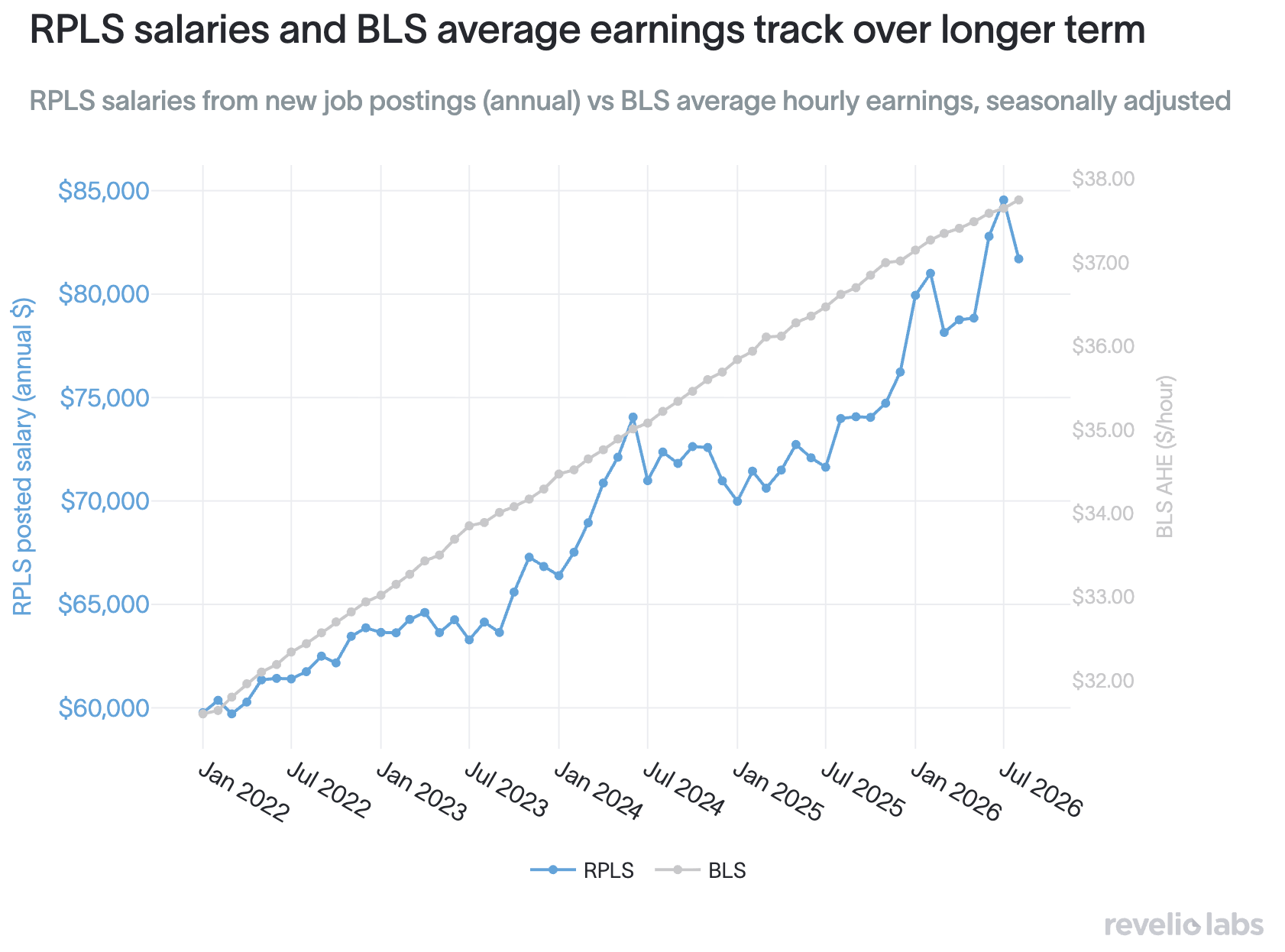
On pay, both RPLS and BLS show similar degrees of rising nominal wages over the medium term. But they are broadly answering distinct questions about the labor market, and this distinction matters when the series diverge, as they have at times over the past year.
RPLS measures the price of new talent: advertised annual salaries in new job postings, a flow of what employers are offering for open roles. BLS average hourly earnings measure the pay of the existing workforce: what workers already on payrolls earn, a stock that moves more gradually. Because they measure different things, they can move together over longer horizons, while deviating substantially over shorter periods as market conditions change.
This is something we have observed since we launched RPLS last August, when growth in salaries in advertised postings was flat or declining from a 2024 peak, while BLS data showed relatively steady gains. Over the past year, that weak patch in advertised pay has reversed, with RPLS data showing a relatively steep increase in salaries on offer.
Much of that concentration appears concentrated at the top of the pay spectrum, with the highest-paid, professional roles seeing much faster growth than lower-paid ones over the past year. This can help lift average posted salaries even when broader, stock-based measures are slower to rise. Overall, while both series indicate higher pay, we find that the price of new talent, especially for higher-paid, high-skilled roles, is rising faster than economy-wide earnings.
How did we do?
A year in, RPLS has largely done what we built it to do: Provide an independent, timely read on the labor market that can be evaluated alongside the official statistics. Just as importantly, a year of comparison has made clearer where the series is strongest, where it is more limited, and how those differences should shape the way it is used.
On the headline employment number, RPLS has tracked the BLS closely, particularly once some of the month-to-month noise is smoothed out. It has also tended to produce a more moderate estimate than either BLS or ADP when the three disagree. At the same time, RPLS understates some of the largest monthly swings, particularly those associated with post-pandemic recalls, and its revisions have been larger than the BLS’s over the past year. Those are meaningful limitations, and understanding them is part of building a better measure.
The comparisons are also a reminder that disagreement between datasets is not always evidence that one of them is wrong. RPLS and JOLTS, for example, measure somewhat different forms of worker movement, while RPLS postings provide a similar signal on labor demand with roughly a month’s lead time. Different data sources illuminate different parts of the same labor market.
That, ultimately, is the case for alternative workforce data. Official statistics remain the benchmark: their transparent methodology, broad mandate, and long history make them indispensable. But no single source can capture every dimension of a labor market this large and fast-moving. As survey response rates decline and new forms of work and hiring become harder to observe in traditional data, complementary measures can add timeliness, granularity, and an independent point of comparison.
RPLS was built in that spirit: Not as a substitute for public statistics, but as another lens through which to understand them. Keeping it free and public allows us, and everyone using it, to keep testing that lens as the labor market changes.
We’ll continue refining RPLS while connecting it more closely with the other signals we track, including our AI Job Market Tracker. The goal is the same as it was at launch: to make the labor market easier to see, measure, and understand in real time.
Free to reproduce with attribution and a link to reveliolabs.com.
Cite this article
- Plain text
- Revelio Labs, "One Year of Revelio Public Labor Statistics: A Retrospective," September 8, 2026.
- HTML
- Revelio Labs, "<a href="https://www.reveliolabs.com/news/macro/one-year-of-revelio-public-labor-statistics-a-retrospective">One Year of Revelio Public Labor Statistics: A Retrospective</a>," September 8, 2026.
- Academic
- Abdelwahed, L., Simon, L. K., Zweig, B., & Wheeler, J. (2026, September 8). One Year of Revelio Public Labor Statistics: A Retrospective. Revelio Labs.


